7 Tips For What To Wear For Fall Family Photos
Fall photos are here and I know you’re scrambling to figure out what to wear and how to style your family for your annual tradition of Autumn photos.
I know you’ve been thinking about the changing colors of the season, the leaves on the ground, the brisk air, pumpkin spice lattes, or pumpkin anything, and the smell of wood-burning fireplaces. It’s nostalgic isn’t it?
Okay… let’s follow those fall smells right into planning out your lifestyle session!
I am taking the guesswork out of your outfit planning and styling, and helping you figure out exactly what to wear for your photos and how to style your family’s outfits too! Regardless of the location or background you plan these tips are going to make it simple as apple-pie for you. 🥧
Speaking of…who even came up with that saying? Pie is nowhere near easy to make, but sure is easy to enjoy! Maybe that’s where it came from! Well, hopefully this list is just as easy for you to enjoy and digest.
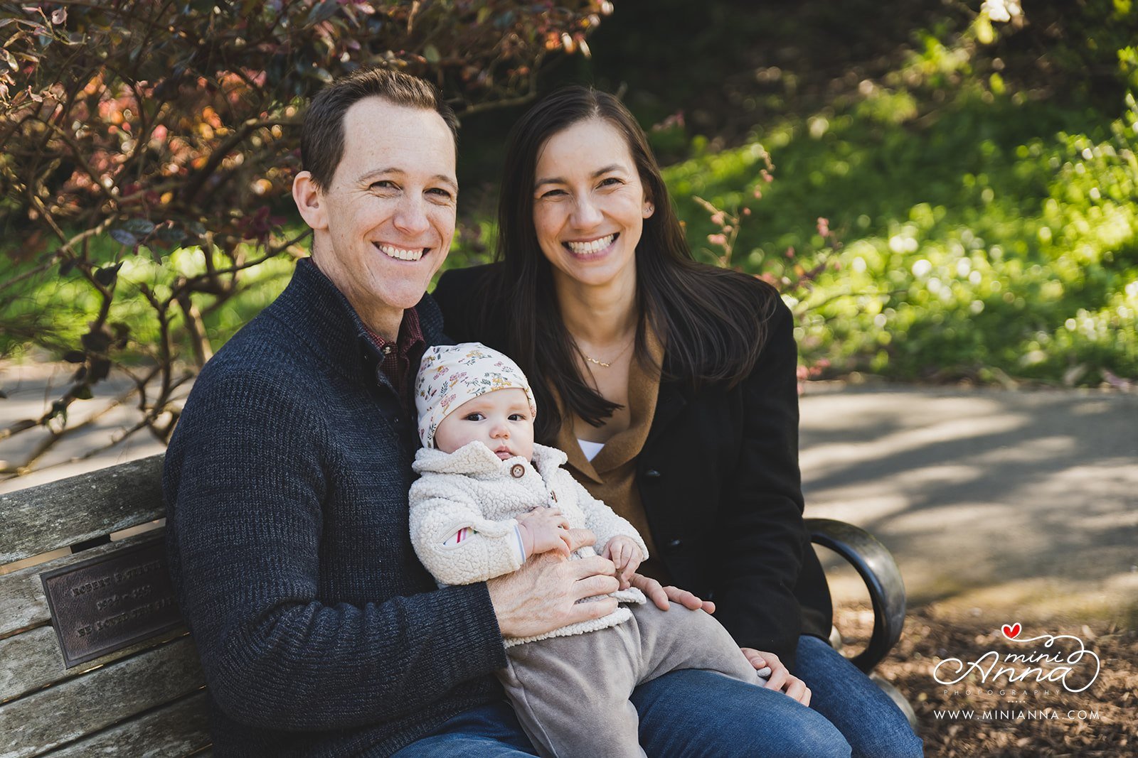
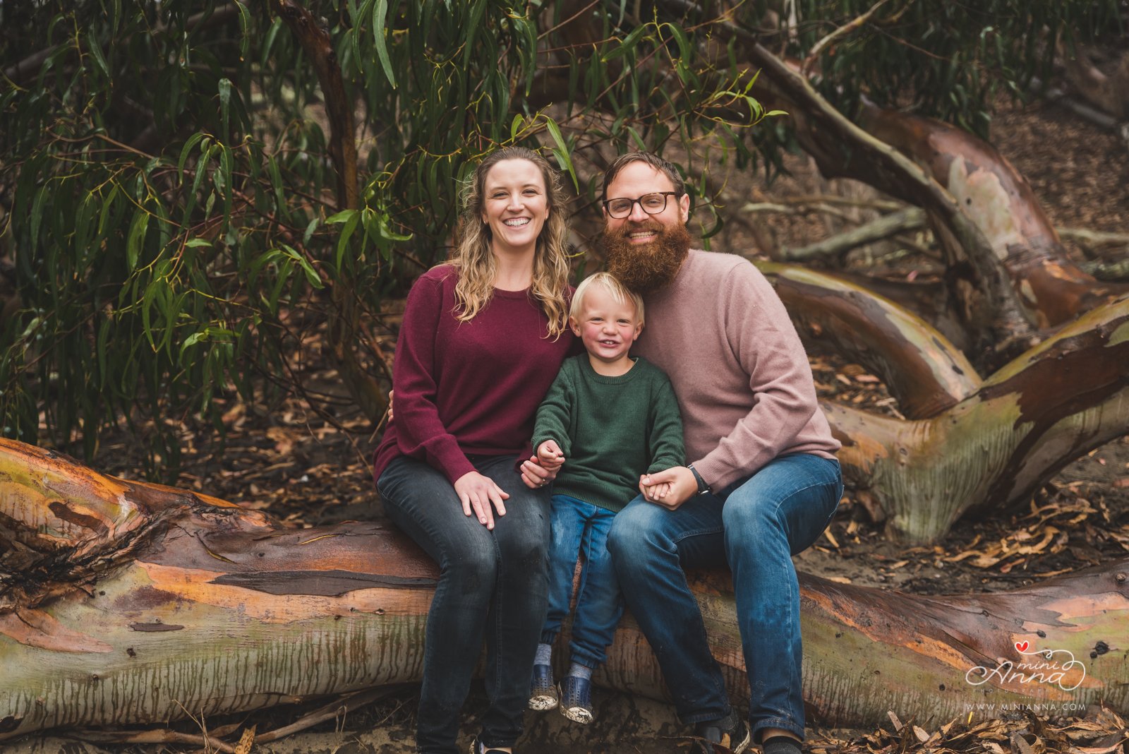
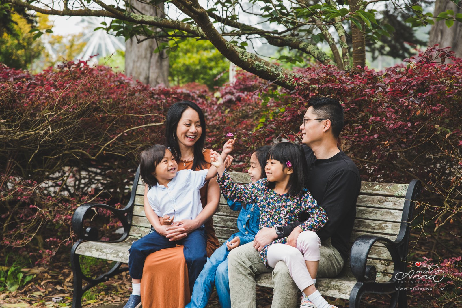
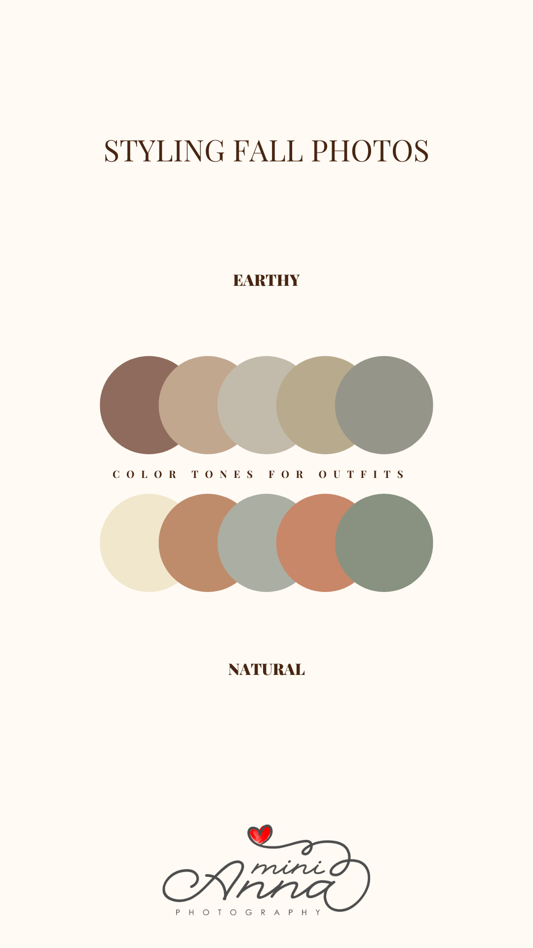
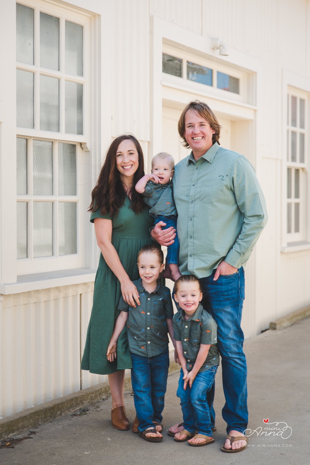
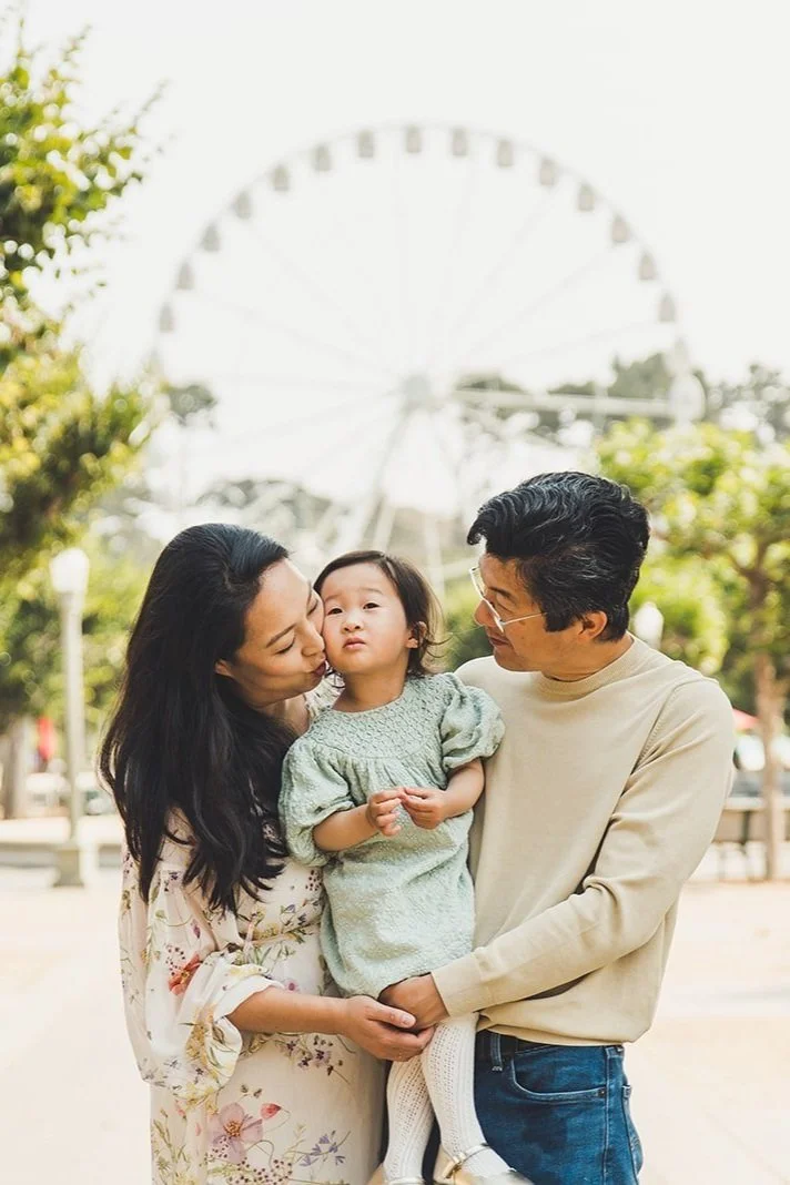
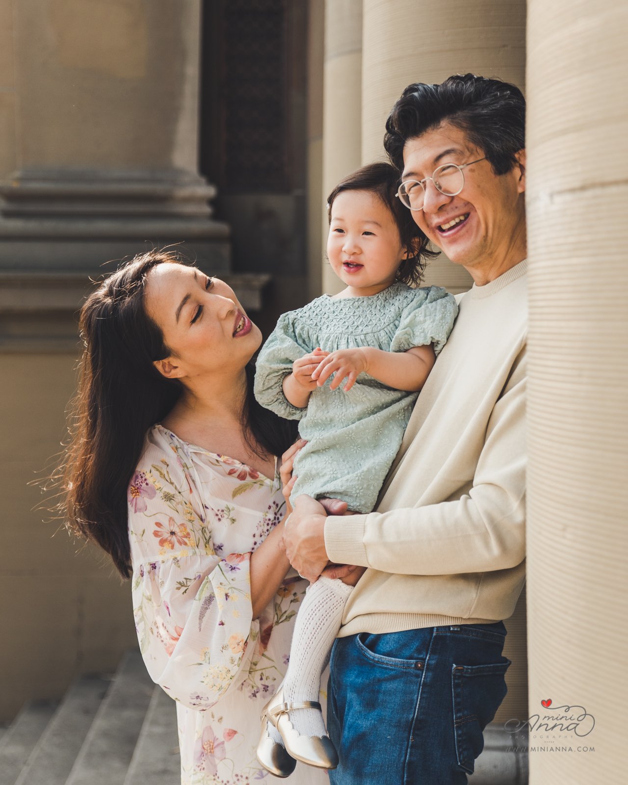
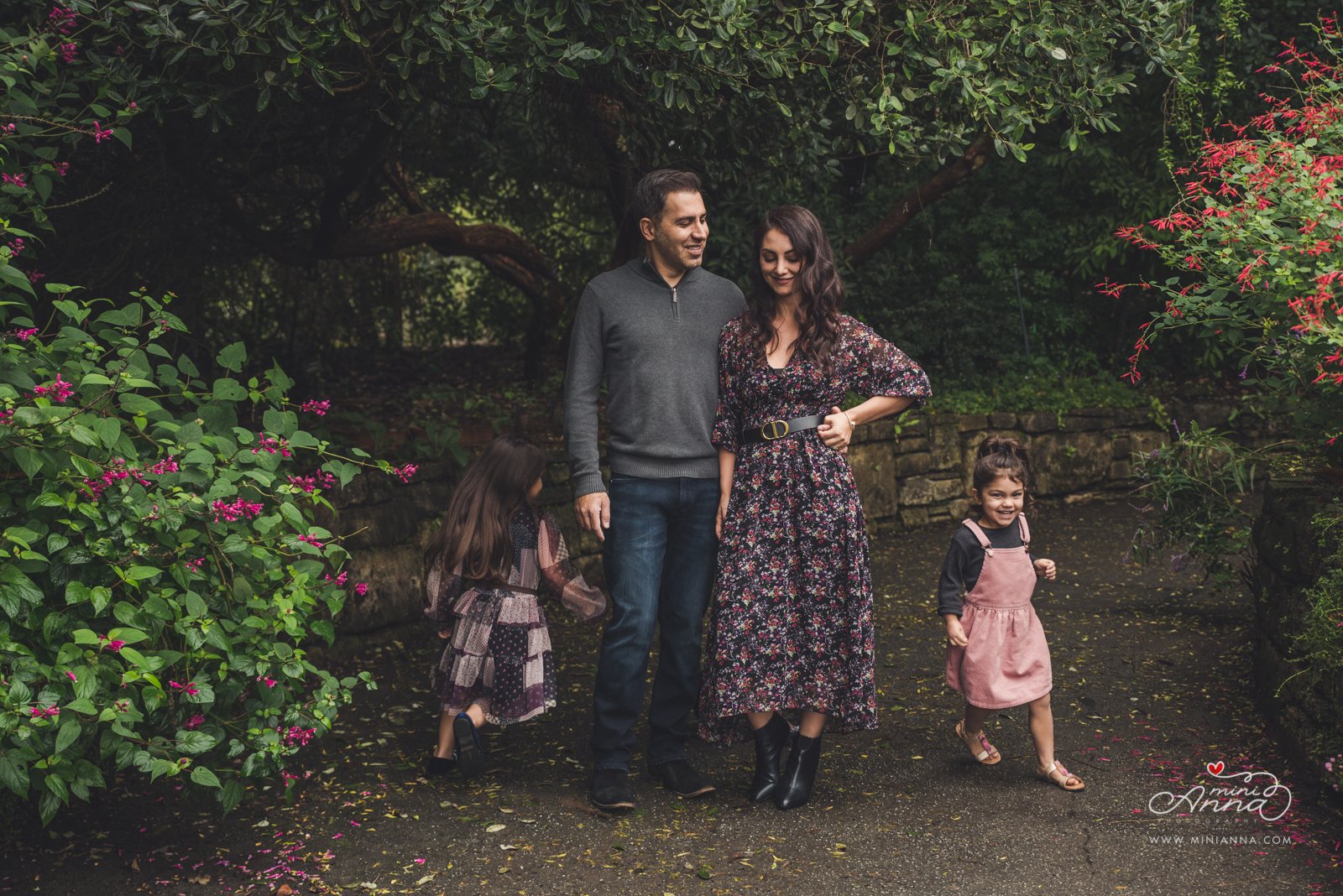
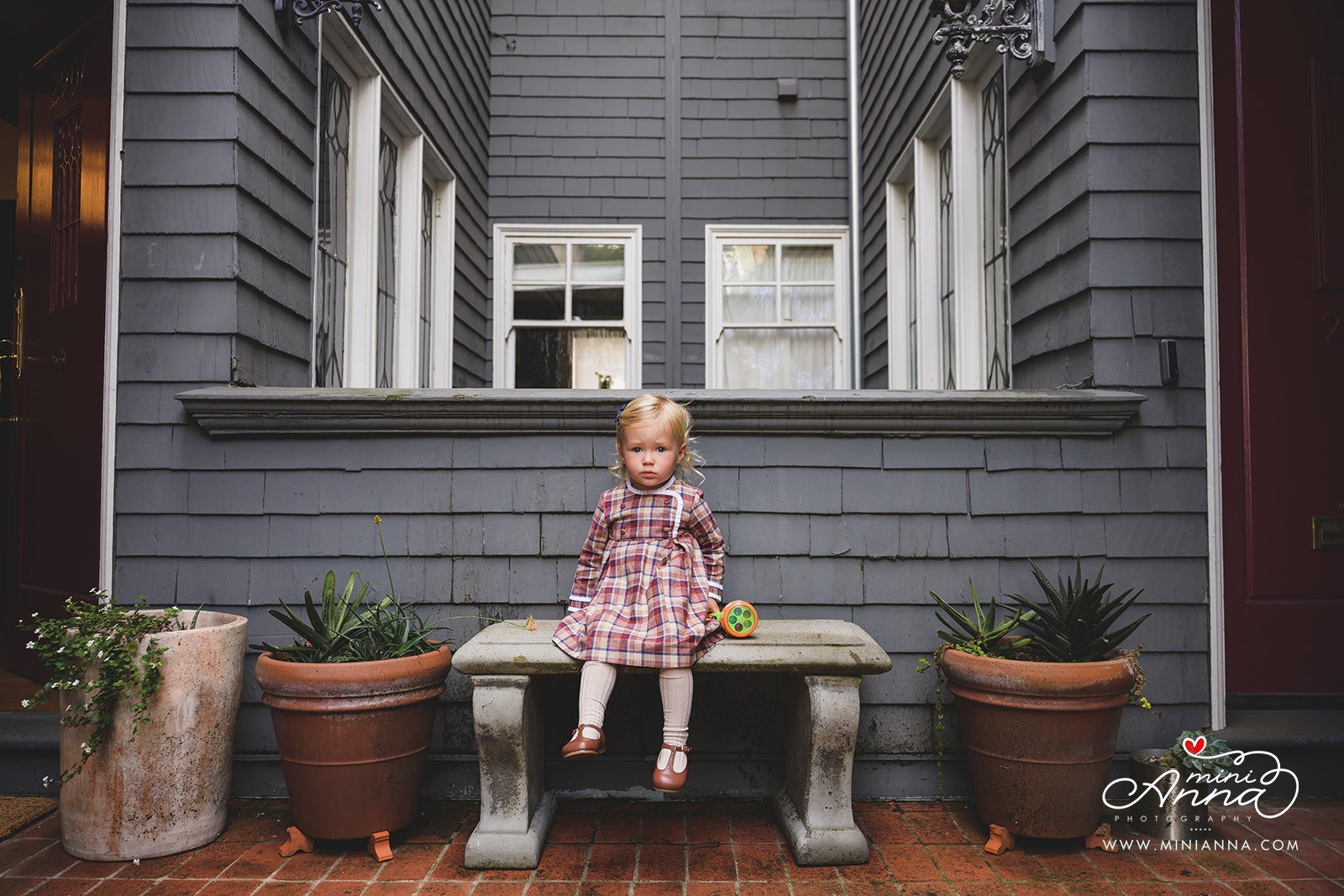
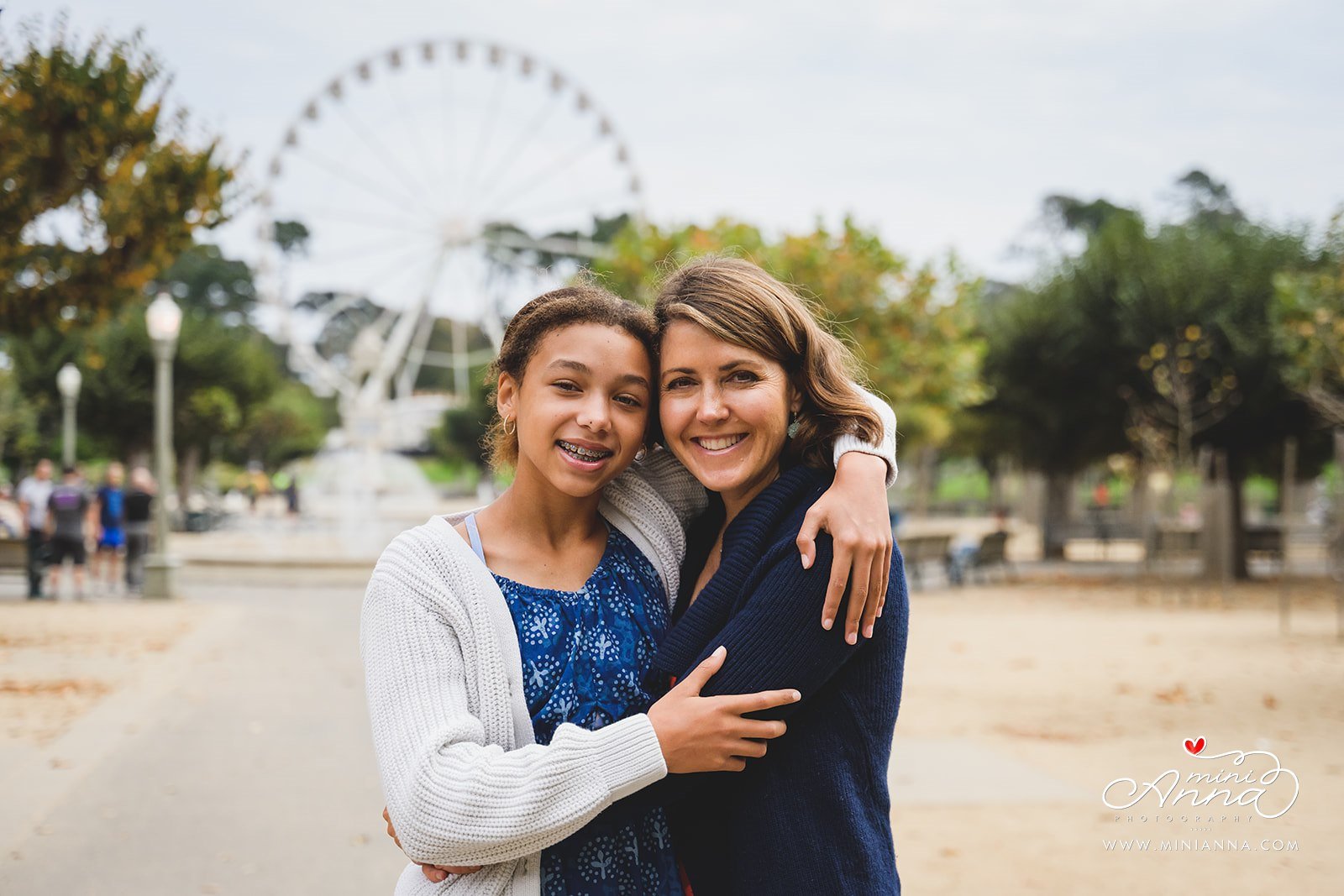
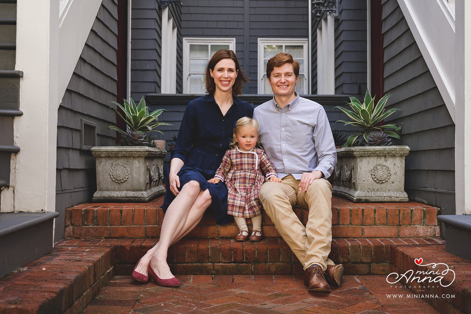
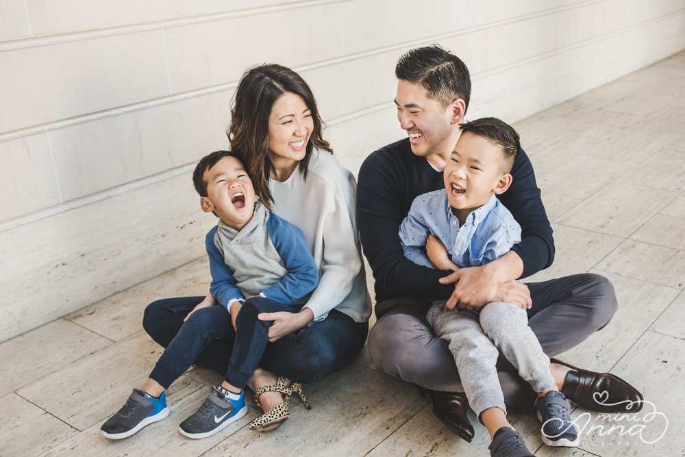
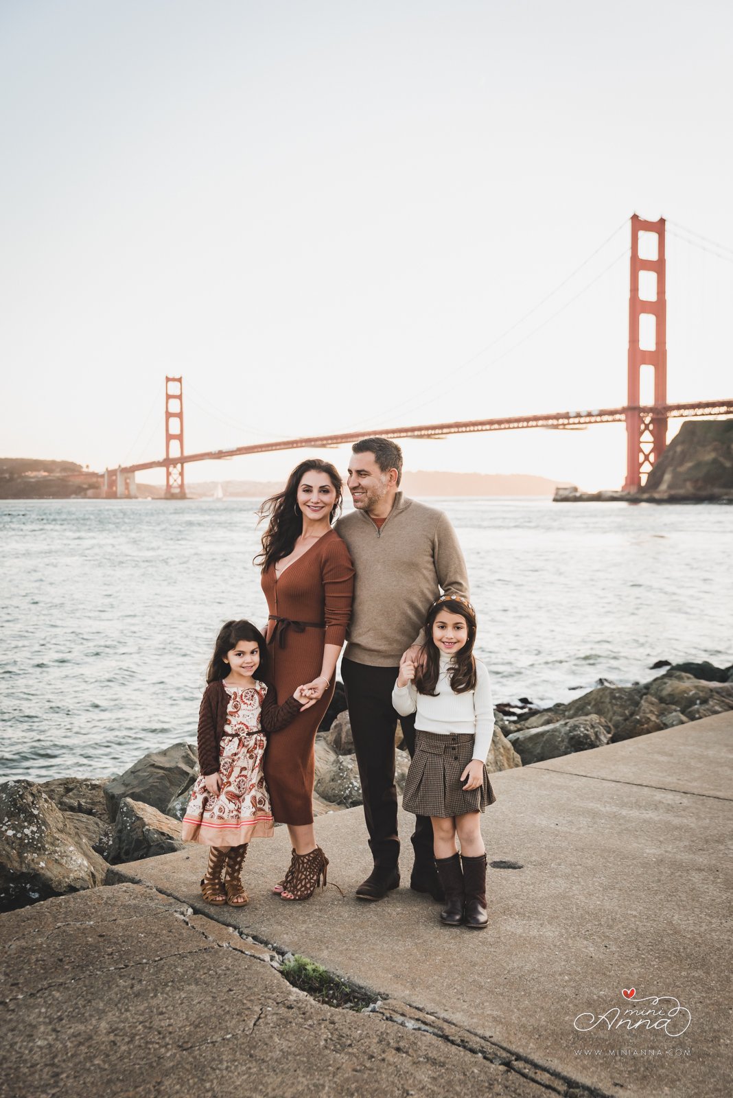
1. Neutrals are a family’s best friend
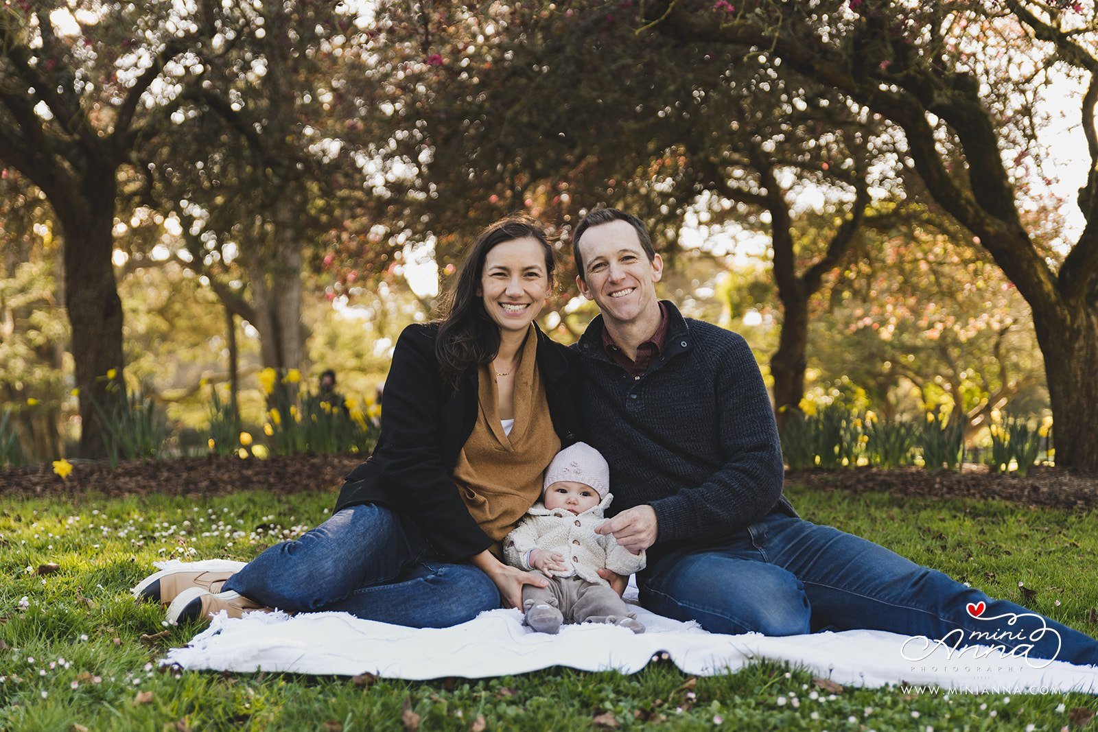
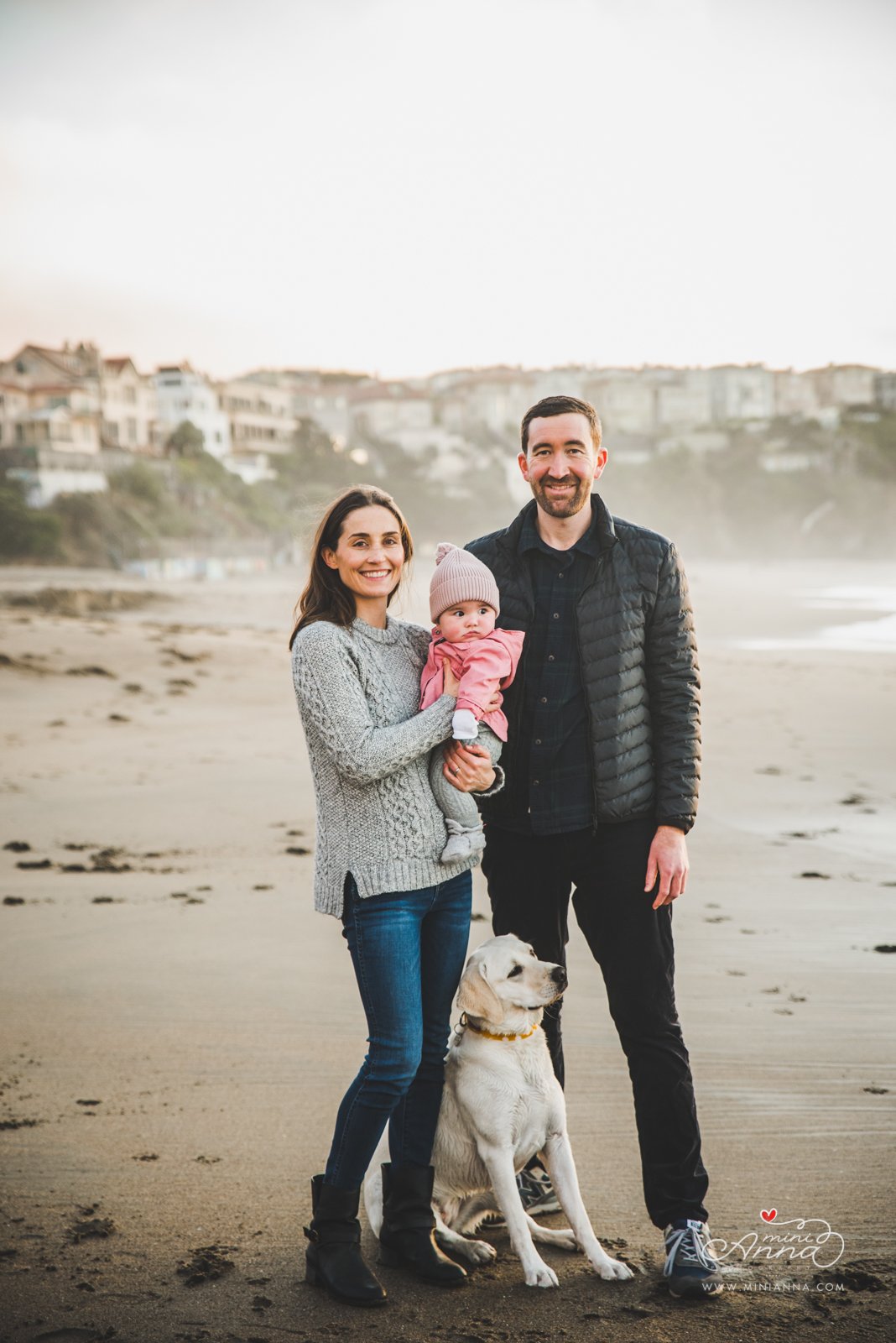
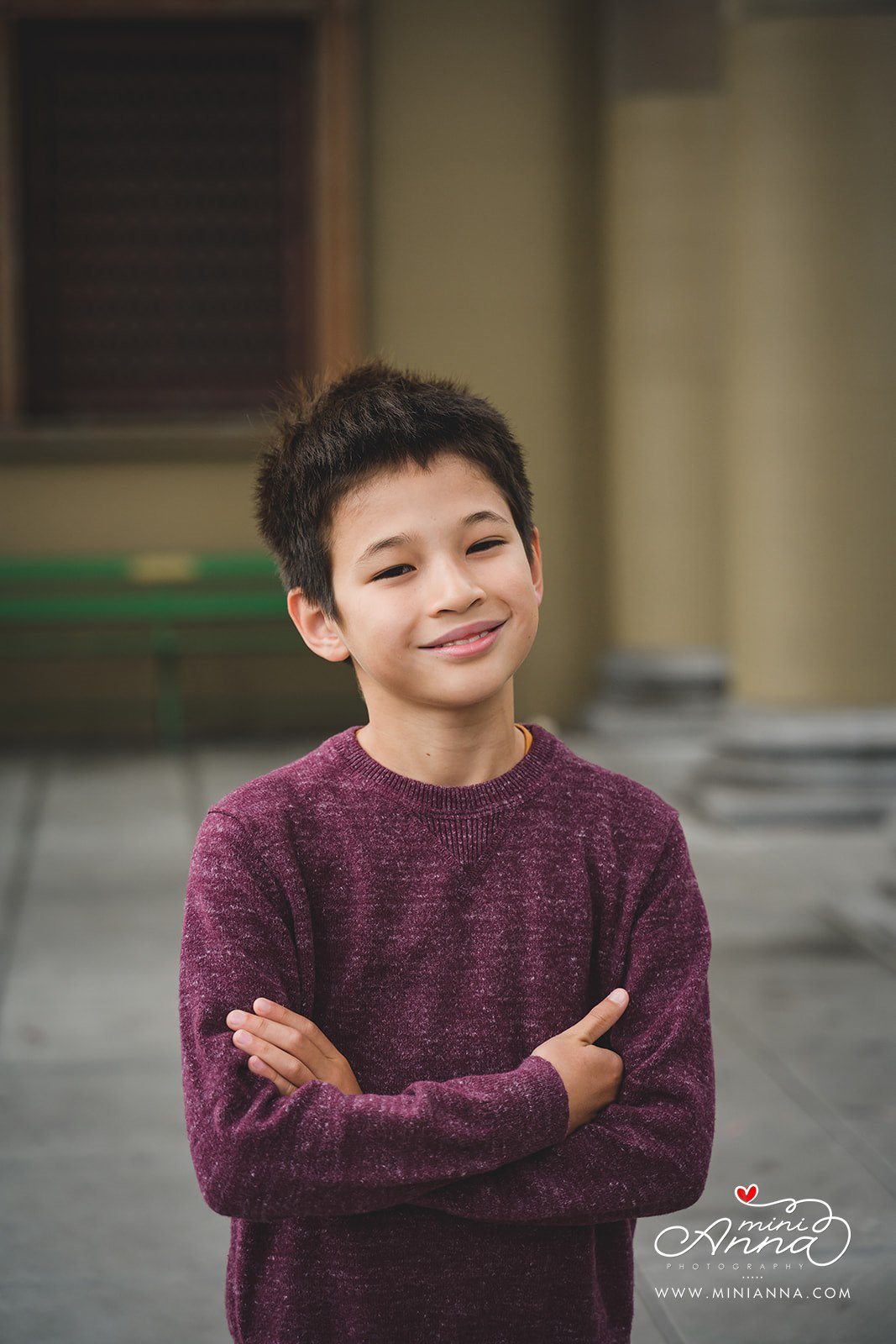
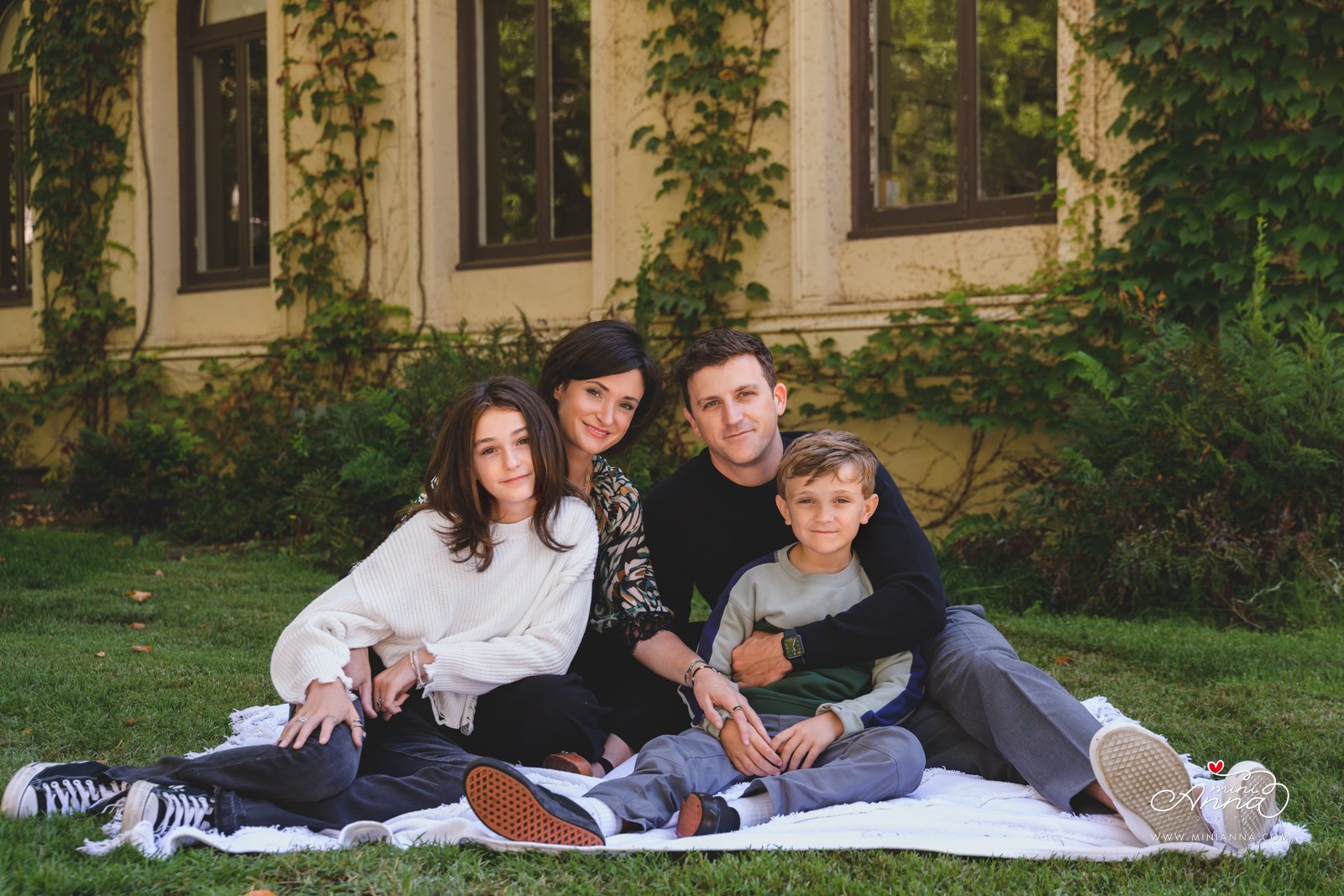
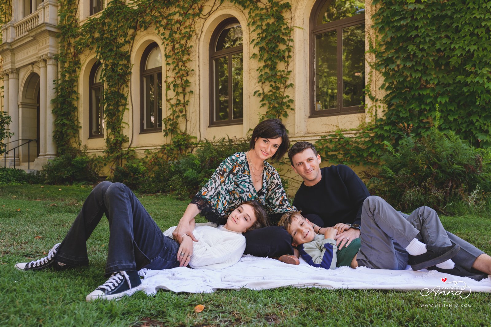
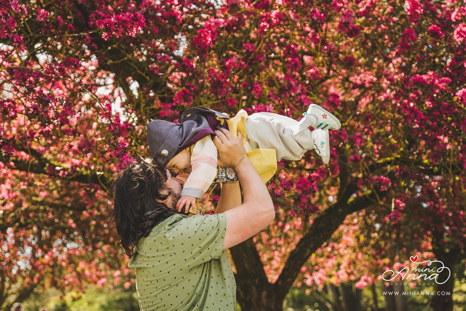
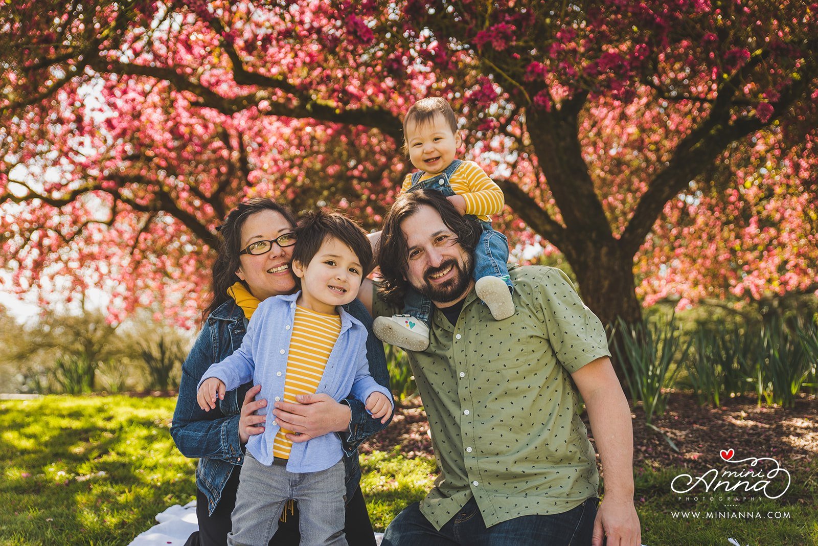
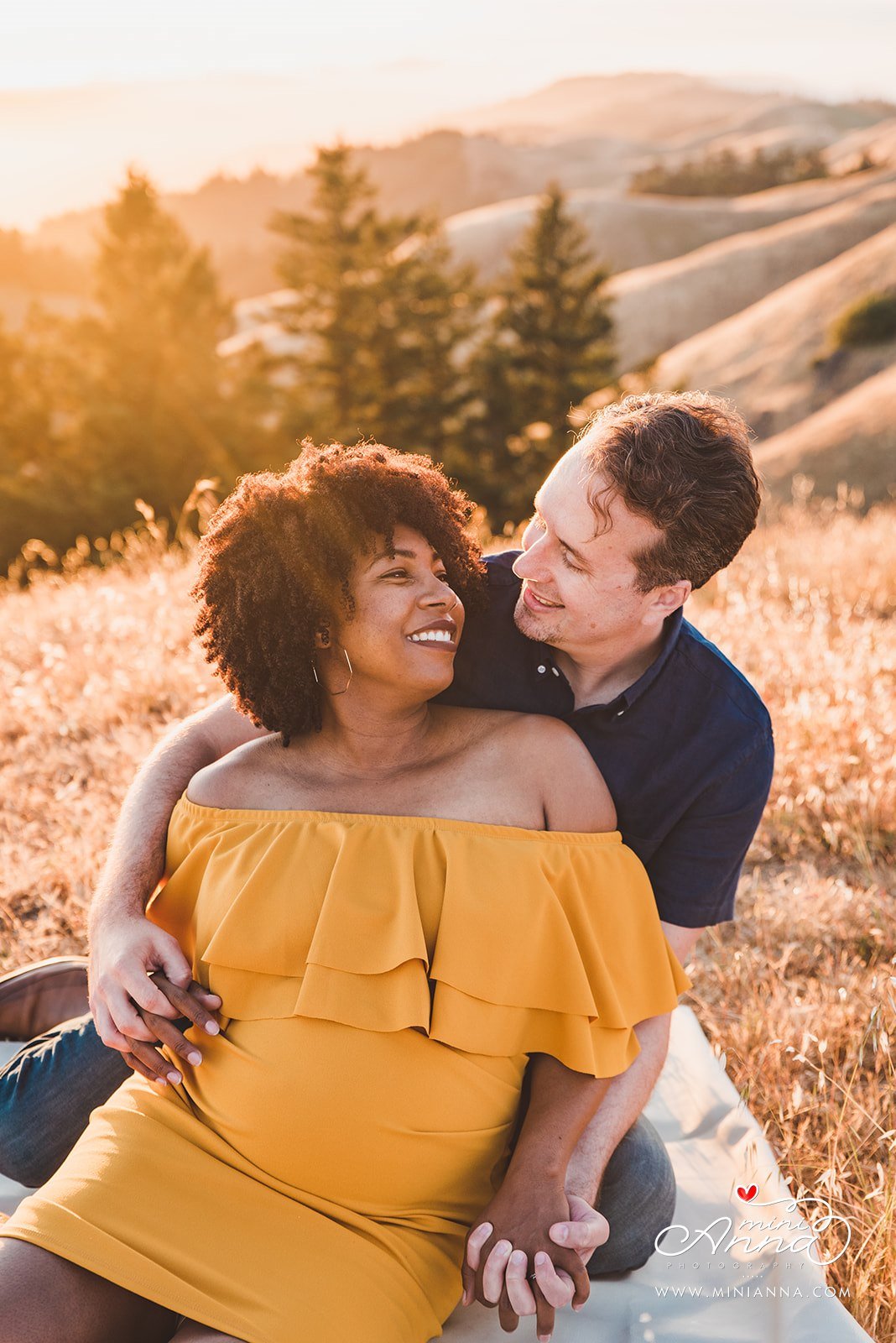
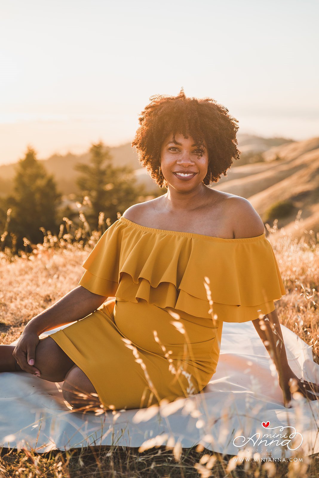
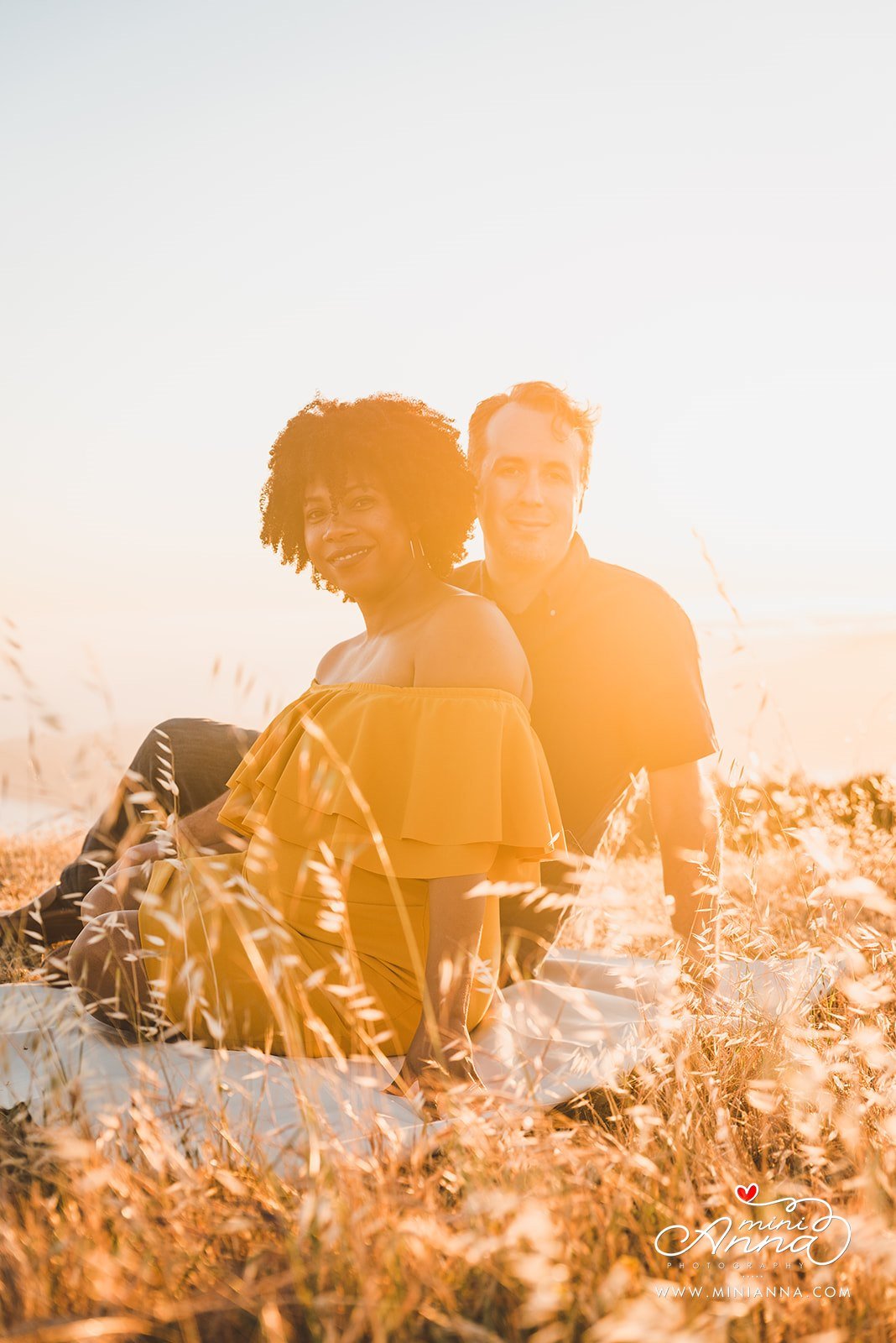
For your family photos plan to wear mostly neutral colors and then add subtle pops of earthy color. You can skip the white and go for ivory or cream, and instead of VERY bold colors, choose more muted hues, warm shades of ivory or cream, beige, cream, gray, blue, green, and latte or mocha.
Best color combos are those that complement each other: neutral + warm + cool color. Skip any neon colors, because they will steal attention away from the subject and reflect poorly on skin tones.
Ok, sorry, I’ll stop nerding out about color theories.
2. Patterns or solids? That sure is the question!
Actually, soft patterns paired with solids is a great way to add some texture and variety – you want to coordinate, but not match everyone. You also don’t want everyone wearing patterns either as this can be too busy and distracting and will actually take your attention away from you and your family. This is your opportunity to coordinate everyone together (and don’t worry, I have a tip coming up for this!)
3. It’s all about that….home décor style!
I really urge you to consider your home décor and color scheme as these photos and images are likely to be hung in your home and displayed, and you want them to flow in your space and feel natural. We don’t want super BOLD colors when your home is more of a muted/calming environment, or clash with the colors you already have. That’s why more mutes hues, earthy tones, and soft creams and ivorys perform best.
4. Accessories are the icing on top
Think about little accessories you can add to up-level your outfit. Shop your own closet and vanity for earrings, a necklace or bracelet, tie, scarves, belts, hats, vests, a bold lipstick, etc. You can get creative here, but remember to stick within the same general color scheme discussed above.
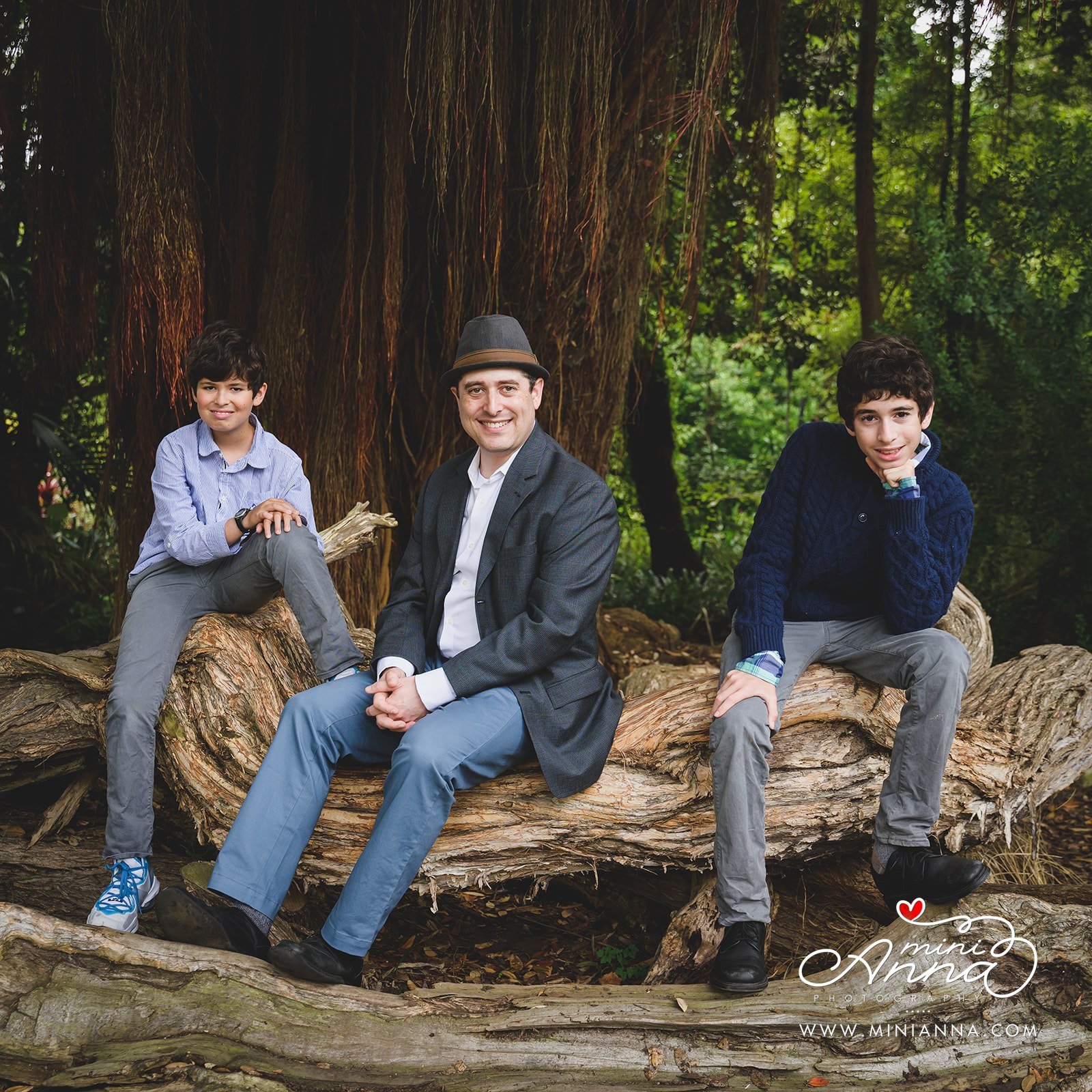
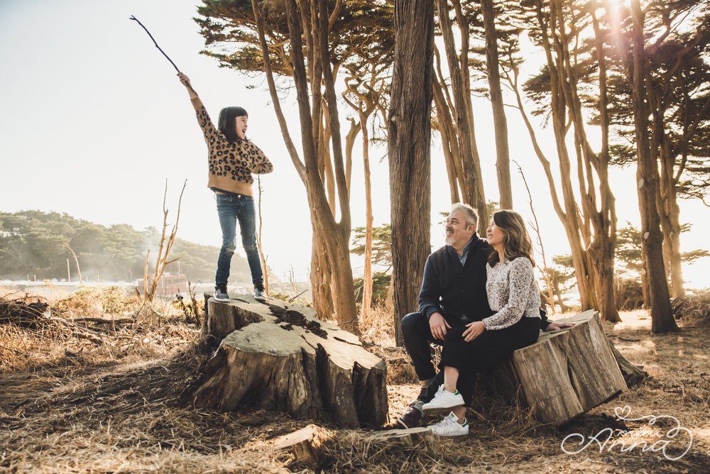
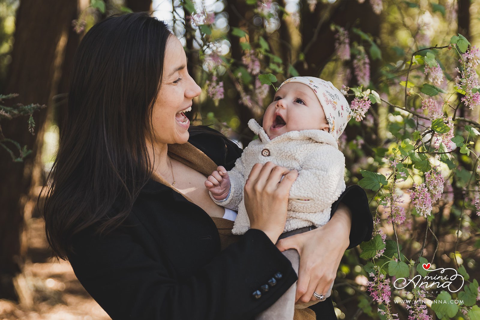
5. Textures and layers are your friend, I promise!
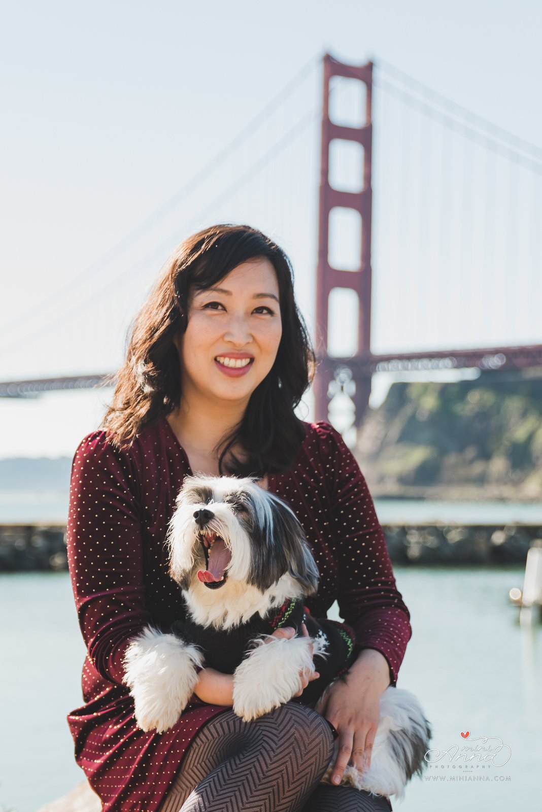
Textures add depth and dimension to your photos They add dimension to your photos and can really tie your outfit together. Not to mention, they help keep you warm. It’s fall in the bay area, and we all know how that can be. Brrrr! Especially at photo locations with a view of the Golden Gate Bridge!
6. These boots were made for walking, and your shoes were too!
When it comes to shoes, make sure that your shoes matches your your clothing and your personalities. If you can, choose shoes or boots for your photos that are earthy (beige, brown, tan, cream-color, etc.)
Please bring a comfy walking pair in case you need to walk through some messier areas, or have a bit of a walk to get to where your pictures are. This is especially helpful if you or your kids are planning to wear new shoes or fancy but uncomfortable shoes like stilettos. You can swap into the shoes for your portrait once you get settled in your photoshop location(s).
7. It all starts with one person, wild right?
Start with one person’s outfit and then plan everyone else’s based on that one. It will make it less overwhelming and ensure your outfits all flow with each other.

And just as a bonus tip… (you guys know how I love to give these!)
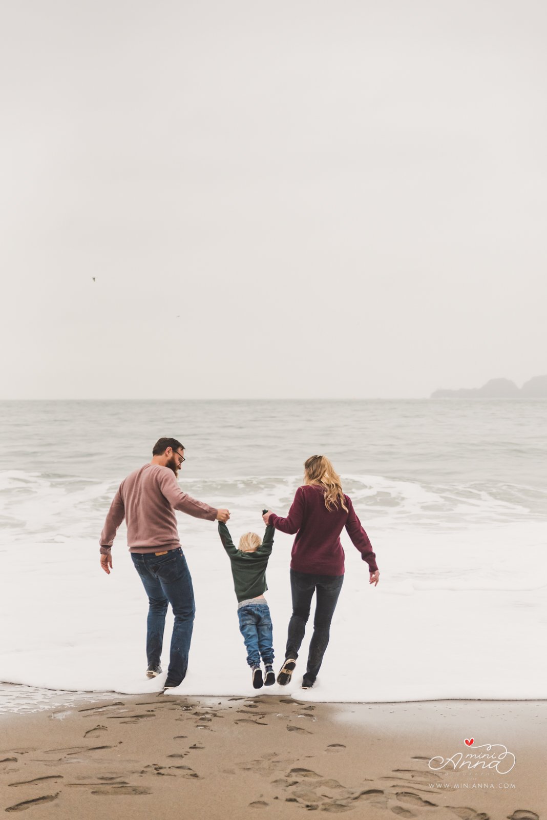
if you have a favorite blanket to incorporate that will do well outdoors, bring it along. Blanket colors and patterns that look really great for photos and don’t distract too much would mostly be creamy white, soft muted patterns, and earthy tones. Even better if it has some texture to it (like a knit blanket). These are not always needed for sessions, but it can be a fun prop to have for wrapping around you guys and bundling together, or to sit on for family photos. And it will carry so much for meaning and match the décor/blankets in your home.
I am confident with these tips you’re going to fly right into your family sessions stress-free and your final fall family photo gallery is going to blow you away!
If you are ready to book your fall family photos, connect with me! I host annual fall and holiday mini family, maternity, and couple photo sessions too! Head over to my booking page and check out all of my session options! www.minianna.com/book
Not ready to book a session yet? Follow me at Instagram.com/minianna.photo for more studio and outdoor family photo inspo! See you there!